Loading...
Title : "We tend to overstate the poverty of the style that precedes a style we admire..."
link : "We tend to overstate the poverty of the style that precedes a style we admire..."
"We tend to overstate the poverty of the style that precedes a style we admire..."
"... histories of rock and roll treat what accompanied it on the airwaves of the fifties as if the music were all 'Sing Along with Mitch' and 'How Much Is That Doggie in the Window?,' when it was also Sinatra’s concept albums, Sarah Vaughan’s collaborations with George Treadwell, and Dave Brubeck’s million-selling recording of a jazz instrumental in five-four time. And so we remember paperback books, pre-Push Pin, as either clinically bare, as with Modern Library editions, or outlandishly lurid, as with an edition of 'Madame Bovary' featuring an Ava Gardner-style femme fatale, complete with slipping negligee....There was, in truth, much ambitious 'art' illustration in those years, including Ben Shahn’s covers for S. J. Perelman and Kauffer’s cover for Ralph Ellison’s 'Invisible Man.'"Writes Adam Gopnik in "How the Graphic Designer Milton Glaser Made America Cool Again/From the poster that turned Bob Dylan into an icon to the logo that helped revive a flagging city, he gave sharp outlines to the spirit of an age" (The New Yorker).
Here are those Ben Shahn covers.
Here's that Kauffer cover.
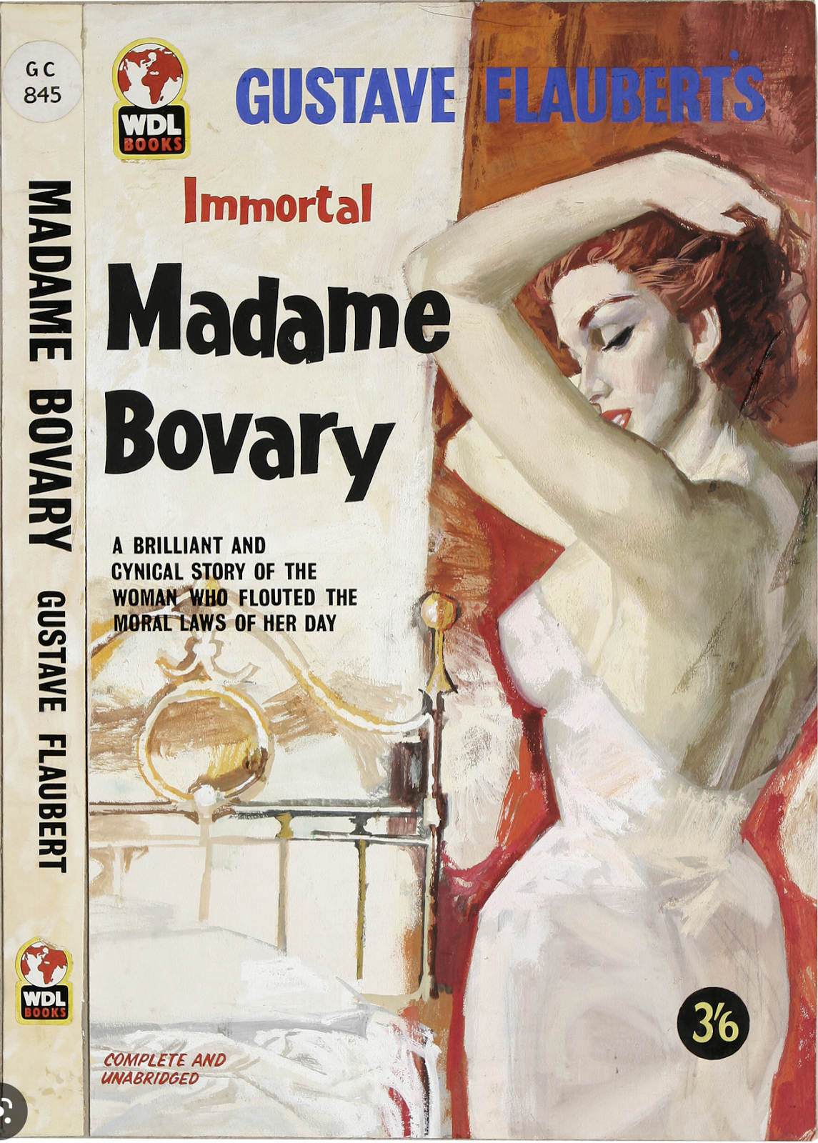
And I think this might be the referenced "outlandishly lurid" "Madame Bovary" cover:

Loading...
"... histories of rock and roll treat what accompanied it on the airwaves of the fifties as if the music were all 'Sing Along with Mitch' and 'How Much Is That Doggie in the Window?,' when it was also Sinatra’s concept albums, Sarah Vaughan’s collaborations with George Treadwell, and Dave Brubeck’s million-selling recording of a jazz instrumental in five-four time. And so we remember paperback books, pre-Push Pin, as either clinically bare, as with Modern Library editions, or outlandishly lurid, as with an edition of 'Madame Bovary' featuring an Ava Gardner-style femme fatale, complete with slipping negligee....There was, in truth, much ambitious 'art' illustration in those years, including Ben Shahn’s covers for S. J. Perelman and Kauffer’s cover for Ralph Ellison’s 'Invisible Man.'"
Or... this fits the description better (but it's a British edition):
Writes Adam Gopnik in "How the Graphic Designer Milton Glaser Made America Cool Again/From the poster that turned Bob Dylan into an icon to the logo that helped revive a flagging city, he gave sharp outlines to the spirit of an age" (The New Yorker).
Here are those Ben Shahn covers.
Here's that Kauffer cover.
And I think this might be the referenced "outlandishly lurid" "Madame Bovary" cover:
Thus articles "We tend to overstate the poverty of the style that precedes a style we admire..."
that is all articles "We tend to overstate the poverty of the style that precedes a style we admire..." This time, hopefully can provide benefits to all of you. Okay, see you in another article posting.
You now read the article "We tend to overstate the poverty of the style that precedes a style we admire..." with the link address https://welcometoamerican.blogspot.com/2023/03/we-tend-to-overstate-poverty-of-style.html
0 Response to ""We tend to overstate the poverty of the style that precedes a style we admire...""
Post a Comment